

King of Immunoassays, ELISA! Probably, there is no need to explain the importance of ELISA here! I am going to have a few posts on ELISA to capture my thoughts and experience. Hopefully, they help others. The ELISA data quality is as good as the quality of the standard curve. So, let’s start this thread with a discussion on the standard/calibration curve.
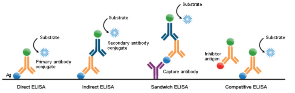
Different enzyme-linked immunosorbent assay (ELISA) types. Each ELISA might need a different standard curve based on the way standards are prepared, and the parameters (e.g., analyte, detection method, specific antibodies used). Image is from here https://commons.wikimedia.org/wiki/File:ELISA_types.png
ELISA is a multifaceted bio-physical phenomenon combining liquid-solid adsorption, biochemical binding (specific and nonspecific), and mass transfer (oh yeah, the world is not perfect!). Each of these is affected by thermodynamic (temperature for instance) and kinetic (molecular crowding and heterogeneity to name a few) factors. To make this beautiful soup quantitative, we use a clean/pure antigen with a known concentration as the standard. However, things can be less than ideal.
In the ideal world, one might expect to observe an adsorption isotherm (such as Langmuir) or a pseudo-first-order reaction for the ELISA standard curve. However, there are a few factors that deviate reality from expectations, such as heterogeneity in a mobile analyte or in ligand population on the surface, and mass transfer limitations. It is hard to quantify these because we use an optical biosensor (such as a plate reader) to measure the output signal. I found this paper very informative on this topic https://www.cell.com/biophysj/pdf/S0006-3495(03)75132-7.pdf Briefly they “… explored whether it is possible to retrieve information on the combined distribution of affinity and kinetic parameters of heterogeneous populations of analytes or immobilized sites”, and concluded that “… the obtained two-dimensional kinetic and affinity distributions have a higher resolution than corresponding affinity distributions based on the isotherm analysis alone.”
Each ELISA is different. For some assays, a linear curve might work well, but for most cases, we use a four-parameter logistic (4PL) when analyzing ELISA data. I personally found a cubical polynomial regression model might be good enough in some cases. Here is a paper that compared the quadratic, cubic, and 4-parameter logistic models for fitting sandwich-ELISA data. https://pubmed.ncbi.nlm.nih.gov/18822292/
In my opinion, any curve that satisfies the following conditions can be used as a standard curve with an acceptable accuracy:
- Cover the measurement range. Any curve might fail to predict when extrapolated outside of its’ measured range.
- CV<20% between repeats of each dilution. In most cases, wet-lab variabilities are more to blame than the fitted model. Ensure that the standard curve is replicable.
- Have good recovery for standard values. The model needs to have a recovery in the 80% to 120% range when back-calculated for standard values. This also can help to define the range of the calibration curve.
- For best predictability, try to have at least two dilutions for samples in the linear range of the calibration curve.
- The predictability of the calibration curve (which is obtained from a pure/clean analyte) might be compromised due to the matrix effect in real sample solutions. Try to find the OD range that generates the best linearity for two consecutive sample dilutions.
The Four-Parameter Logistic (4PL) model, also known as the Hill equation, is defined by the following equation.
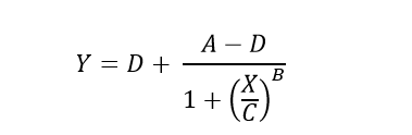
Which can be rearranged to solve for unknown concentrations (X) from known plate reader signal (Y).
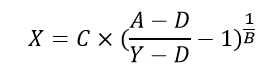
Where,
- Y is the plate-reader output (OD).
- X is the stimulus or independent variable (analyte concentration).
- A is the upper asymptote, representing the maximum response achievable.
- D is the lower asymptote, representing the minimum response achievable.
- C is the inflection point or the stimulus at which the response is halfway between the lower and upper asymptotes.
In more detail,
“A” is the Upper Asymptote which represents the maximum optical density or signal observed in the assay. This is the signal obtained when the analyte is present at very high concentrations, saturating the binding sites on the assay components (e.g., capture and detection antibodies, enzyme substrate, etc.). In other words, it reflects the maximum achievable response in the assay.
“D” is the Lower Asymptote which represents the minimum or background optical density or signal obtained when there is no analyte present in the sample. This is the baseline signal in the absence of the analyte.
“C” is the Inflection Point is the concentration of the analyte at which the response (optical density or signal) is halfway between the lower and upper asymptotes. It indicates the concentration at which the binding sites in the assay are 50% saturated.
“B” is the Hill Slope which in ELISA determines the steepness or slope of the curve at the inflection point. A higher B value indicates a steeper curve, reflecting a more abrupt transition from the lower to upper asymptotes.
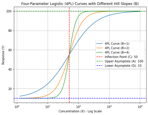
Out of these four parameters, the Hill slope (“B”) probably has the most biological depth. It is named after Archibald Hill who formulated the Hill–Langmuir equation in 1910 to describe the sigmoidal O2 binding curve of hemoglobin. Biophysically, a high Hill slope in ELISA can signify specific aspects of the interactions and binding processes involved in the assay such as cooperative binding meaning binding is often enhanced if there are already other ligands present on the same macromolecule. Nevertheless, a high Hill slope shows that the assay (ELISA) is highly sensitive to changes in analyte concentration. This can be advantageous for detecting low concentrations of the analyte.
Most modern plate readers’ software automatically fits a 4PL based on standard values based on provided templates. There are also online tools (google 4PL calculator) or software like Graphpad, and of course, you can program it in R and Python. I included a link to our Gihub page where you can find a Jupyter Notebook so that you can test the effect of each factor on the chart.
Here, I tried to summarize a few thoughts on the ELISA calibration curve. In the next few posts, I will discuss other aspects of ELISA.
Happy Analyzing!
Link : https://github.com/Assaydev/4PL/blob/main/4PL%20generator.ipynb